Building a component library is a very important milestone in a products life-cycle. It usually isn’t the first thing anyone talks about in the early stages of a product. Startups usually don’t even hire designers, they give that responsibility to front end or mobile developers to come up with a clean user interface owing to the fact that they might have worked with designers in the past and have picked up on some of the UI/UX knowledge.
Developers usually aren’t keen on building radically different user interfaces, rather they like to go with the “standard”. There are a ton of tooling and open source support for popular design guidelines like the material design. Every platform has a material design theme to it. It’s everywhere. VS Code, websites, mobile apps, and everything that developers build in their free time.
So it’s easy to jump on the open source component library, or CSS framework bandwagon only to realize that the end product looks exactly like a ton of other generic apps out there. In startups, they usually don’t follow any of these popular design guidelines to make the product stand out. BOOM - spaghetti UI code. Divs with weird css, components with custom styles and injected styles. Everything is now coded as a minion.
When a company grows, it quickly realizes that its UI is a mess. When the devs are afraid to open a file, you know something’s seriously wrong. Time to build a custom component library.
Here are a few guidelines that I follow when building component libraries or new components in general.
Have A Plan
Before making a component library, plan it out. Don’t hastily jump into it. Think about what components are already in the product. What is not consistent? What could have been a shared element? Make a list of some very commonly used components that needs to be standardized throughout the product. (eg - A Primary Button)
An important point would be to think of all the items that will definitely not be used. The product has no plans on supporting multiple themes, ever? Don’t build a theme system. The product doesn’t want to show loaders inside buttons? Don’t build loading buttons. Period.
Involve the Design Team
There’s a good chance that the UI/UX team has a component library of their own. Involve them in the process and come up with a plan on how a component library must be built. There is no point in making a UI component library without involving the design team. The components will be used not only by the devs to make building features faster, but need to be used by the designers to design features with existing components.
Make Style Immutable with UI states
When making a component library for a specific product, there is more clarity on how elements need to look. The product will have a set of theme colors that needs to be used across the board. The component itself will have complete control over its appearance. The parent component will have no control over how the component is styled whatsoever.
In react / react native, the style prop is used to define the styles of a component. A custom component is usually designed to take a prop called containerStyles (or something similar) that overrides the component’s default style. When the parent wants a component that has a non-standard color, just pass in a containerStyle object, right? Wrong! Non standard components should not be allowed. This should be avoided at all costs. It will only lead to spaghetti code.
Instead, the components just need to take in states or modes. The appearance of the component is determined by the component based on this state. For example, a button can have a state called type which can be primary or secondary. What this means is that the parent is asking for a “primary button” and does not care about how it looks. The button component itself will have all the styles required for the states.
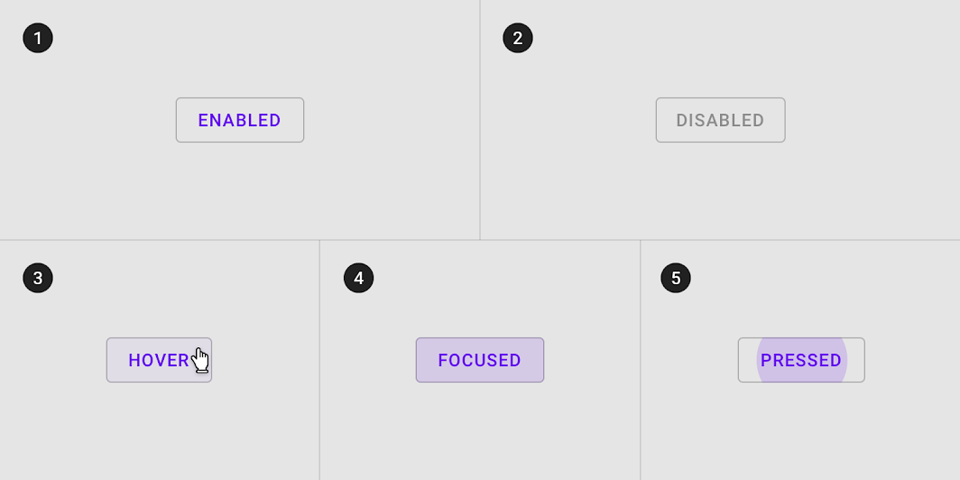
Any extra additions in the future needs to be treated as a design decision and can be easily accommodated later as the style is completely controlled by the component. Just another style state to account for.
Data and testability
UI components shouldn’t really worry about data. It should only accept final forms of data. Data manipulation should be done elsewhere and not in the component. Components should focus on displaying data exactly as it is given to them.
This makes writing tests a lot simpler, to a point where a snapshot test will be enough in most cases. Any extra complications can be trivially included when compared to something decentralized like only using components provided by the framework, in place. This will lead to a certain peace of mind, in knowing that someday one little change will not screw up the whole product.
UI Documentation
Documenting UI components are better done visually. Storybook is a great example of an awesome UI documentation tool. Create a system where anyone can see how a component looks like in isolation. Make a catalogue of different combinations of UI states that a component can appear in. Storybook has “knobs” that can dynamically change UI states, controlled by whoever is reading the documentation.
A component library that is implemented properly will be easy to use, easy to maintain and much easier to teach; given the whole thing is visually documented. The outcome of this whole process should be focused on the benefits it can offer in the future. It makes the whole product feel more mature and familiar. A robust component library can cut down UI development time of new features or redesigns by a significant margin. It can help identify patterns that don’t match the product as a whole.